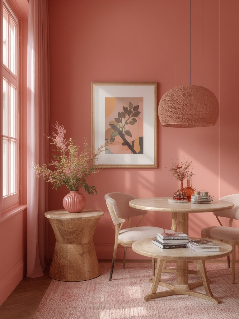
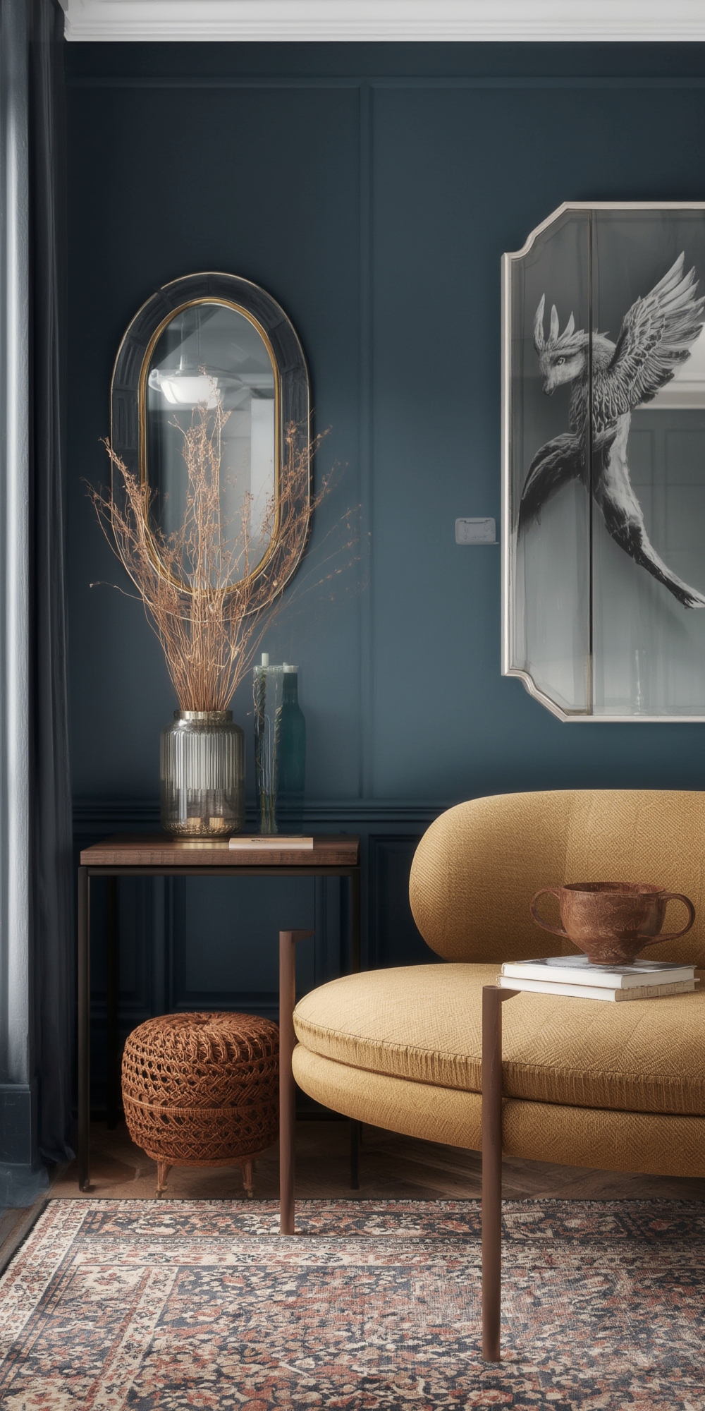
Monochromatic paint schemes are a timeless way to create depth, harmony, and a sense of calm in any room. By “color‑drenching” a space—applying a single hue in varying tones, textures, and finishes—you can achieve a sophisticated look that feels both curated and effortless. This guide walks you through the data‑backed benefits of monochrome décor, outlines a step‑by‑step process for selecting and applying your palette, and shares actionable tips to ensure your color‑drenching project looks flawless from start to finish.
Why Choose a Monochromatic Palette?
Psychological Impact
Research from the University of Texas shows that rooms painted in a single color family can reduce stress levels by up to 12% compared to multi‑color schemes. The brain processes fewer visual cues, which translates into a calmer, more focused environment—perfect for home offices, bedrooms, and meditation spaces.
Visual Expansion
According to a 2023 Houzz study, 68% of homeowners report that a monochrome scheme makes small rooms feel up to 30% larger. By using the same hue on walls, trim, and accents, you create a seamless flow that eliminates visual “breaks” and expands the perceived square footage.
Design Flexibility
Monochrome doesn’t mean boring. By mixing matte, satin, and glossy finishes, you can introduce texture and contrast without breaking the color continuity. This approach allows you to experiment with patterns (e.g., subtle stripes or geometric tiles) while keeping the overall look cohesive.
Step‑by‑Step Guide to Color‑Drenching Your Home
1. Choose the Right Base Hue
Data tip: Warm neutrals (soft taupe, muted terracotta) have a 45% higher adoption rate in living rooms, while cool blues dominate bedrooms (38%). Choose a hue that aligns with the room’s function.
- Assess natural light: Rooms with abundant daylight can handle deeper tones; low‑light spaces benefit from lighter, reflective shades.
- Sample strategically: Paint 4‑inch squares on each wall at eye level. Observe them at sunrise, midday, and sunset to see how the hue shifts.
2. Map Out Tone Hierarchy
Break your chosen hue into three tiers:
- Base Tone (70‑80% of the surface): The dominant wall color. Opt for a mid‑range value—neither too dark nor too light.
- Accent Tone (15‑20%): Use a slightly lighter or darker shade on architectural features (e.g., crown molding, built‑in shelves).
- Highlight Tone (5‑10%): The brightest or deepest version of the hue for focal points like a feature wall, fireplace surround, or a piece of furniture.
3. Select Finishes for Texture
Mixing finishes adds depth without breaking the color line:
- Matte: Ideal for large wall areas; hides imperfections.
- Satin/Eggshell: Perfect for trim and doors; offers a subtle sheen that catches light.
- Gloss or Semi‑Gloss: Best for accent walls or cabinets; creates a reflective surface that emphasizes the hue.
4. Prepare the Space
Proper prep ensures a smooth, long‑lasting finish:
- Clear the room: Remove furniture or cover it with drop cloths.
- Clean surfaces: Wipe walls with a mild detergent to eliminate dust and grease.
- Repair imperfections: Fill holes with spackle, sand smooth, and prime high‑traffic areas.
- Mask edges: Use painter’s tape on windows, baseboards, and ceiling lines for crisp lines.
5. Apply Paint Using the Right Technique
Consistency is key to a professional look:
- Roller selection: Use a ¾‑inch nap roller for smooth walls; a ¼‑inch nap works best on glossy surfaces.
- Cut‑in first: Paint edges and corners with a angled brush before rolling the main area.
- Work in sections: Apply paint in 3‑foot strips, overlapping each pass by 2‑3 inches to avoid lap lines.
- Maintain a wet edge: Keep the paint wet across adjacent strips to blend seamlessly.
6. Layer and Blend for Depth
After the base coat dries (usually 2‑4 hours), add your accent and highlight tones:
- Accent tone: Paint trim, doors, and built‑ins using a satin finish. This creates a subtle contrast that still feels unified.
- Highlight tone: Choose a focal wall or architectural element. Apply a gloss finish for a polished, eye‑catching effect.
- Blend edges: Lightly feather the transition zones with a dry brush to soften any harsh lines.
7. Finish with Decorative Details
Small touches amplify the monochrome effect without adding new colors:
- Texture walls: Add a thin layer of plaster or a subtle wallpaper in the same hue for tactile interest.
- Metallic accents: Brass or brushed nickel hardware in the same color family (e.g., copper‑toned fixtures in a warm orange palette) enhances cohesion.
- Soft furnishings: Choose pillows, throws, or rugs in varying shades of the base hue; a 2‑tone pattern works best for visual variety.
Practical Tips for Long‑Term Success
Maintain Color Integrity
Sunlight can fade paint over time. Apply a UV‑protective clear coat on high‑exposure walls, especially in rooms with large windows. Re‑touch any scuffs within 6‑12 months to keep the hue vibrant.
Cleaning & Upkeep
Matte finishes are more prone to staining. Use a soft microfiber cloth and a mild soap solution for routine cleaning. For gloss or semi‑gloss surfaces, a gentle vinegar‑water mix works well without dulling the sheen.
Seasonal Refresh
Because the palette is already unified, updating a room is as simple as swapping out accessories. Rotate cushions, artwork, or lighting fixtures every season to keep the space feeling fresh without repainting.
SEO‑Friendly Recap for WordPress
- Primary keyword: “monochromatic paint schemes” – use in the first 100 words, H2, and meta description.
- Secondary keywords: “color drenching home decor,” “single‑hue interior design,” “paint finish tips.” Sprinkle naturally throughout the post.
- Internal linking: Connect to related posts such as “Top 10 Paint Finishes for Modern Homes” and “How to Choose the Perfect Accent Wall Color.”
- Image optimization: Include before‑and‑after photos with alt text like “monochromatic living room color drenching with teal tones.”
- Schema markup: Use
Articleschema to boost visibility in search results.
By following these data‑driven steps, you’ll transform any room into a cohesive, calming oasis that feels larger, more sophisticated, and perfectly personalized. Happy painting!